ウェブページを作成する際、ひと昔前であれば、要素を横並びにするのに「float」を使用していました。
しかし、floatは要素を三次元で捉えなければならず、扱いが難しいプロパティとなっていました。
でも、昨今登場した「Flexbox」を使用すれば、誰でも簡単に要素の並び方を設定することができます。
今回は、そんな「Flexbox」の使い方について基本的な事項をまとめてみました。
ちなみに「Flexbox」は「Flexible Box Layout Module」の略で、CSS3から導入された新しい技術です。
基本の使い方(display : flex)
Flexboxの基本は、親要素に「display:flex」をしてあげます。
例えば、以下のコードで要素を並べてみます。
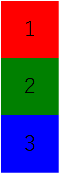
<html>
<head>
<meta charset="UTF-8">
<style>
main{font-size:72px; text-align:center; line-height:200px;}
.square1{background-color:red; width:200px; height:200px;}
.square2{background-color:green; width:200px; height:200px;}
.square3{background-color:blue; width:200px; height:200px;}
</style>
</head>
<body>
<main>
<div class="square1">1</div>
<div class="square2">2</div>
<div class="square3">3</div>
</main>
</body>
すると、以下のように3つの要素(赤・緑・青)が縦並びになります。
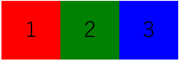
ここで、各要素の親要素として「wrapper」クラスを用意して、wrapperクラスに対して「display:flex;」を設定します。
<html>
<head>
<meta charset="UTF-8">
<style>
main{font-size:72px; text-align:center; line-height:200px;}
.wrapper{display:flex;}
.square1{background-color:red; width:200px; height:200px;}
.square2{background-color:green; width:200px; height:200px;}
.square3{background-color:blue; width:200px; height:200px;}
</style>
</head>
<body>
<main>
<div class="wrapper">
<div class="square1">1</div>
<div class="square2">2</div>
<div class="square3">3</div>
</div>
</main>
</body>
これをブラウザで表示すると以下のように、左から順に横並びになります。
これがFlexboxの基本の使い方です。
要素の並び順を指定(flex-direction)
要素の並び順を指定するには、親要素に「flex-direction」を設定していきます。
flex-directionには、「row」「column」「row-reverse」「column-reverse」の4種類があります。
要素を横並びにする(flex-direction : row)※省略可
単純に要素を横並びにするならば、前述したとおり親要素に「display:flex;」を設定すれば可能です。
これは、Flexboxのデフォルト設定が「flex-direction : row」となっているためであり、この設定によって要素が自動的に横並びになるようになっています。
もちろん明記しても良いのですが、挙動は変わらないため、省略しておいて問題ないと思います。
.wrapper{display:flex; flex-direction:row;}要素を縦並びにする(flex-direction : column)
要素を縦並びにするためには、親要素に「flex-direction : column」を設定します。
横並びにするためにFlexboxを設定したのに、わざわざ縦並びにする意味があるのかと思いますが、これを使用することによって、フッター部分の余白を完全に消すテクニックが存在します。
.wrapper{display:flex; flex-direction:column;}要素を右から左に並べる(flex-direction : row-reverse)
Flexboxを使うと要素は左から右に並びますが、親要素に「flex-direction : row-reverse」と設定すると、右から左に並べることができます。
ちなみに先頭の要素は、ページの右端にくっつきます。
.wrapper{display:flex; flex-direction:row-reverse;}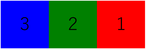
要素を下から上に並べる(flex-direction : column-reverse)
要素を下から上に並べるには、親要素に「flex-direction : column-reverse」を設定します。
先頭の要素は、ページの上端にくっつきます。
.wrapper{display:flex; flex-direction:column-reverse;}
要素を折り返す(flex-wrap)
要素を並べたときに親要素の領域から溢れてしまった場合は、「flex-wrap」を設定すると自動で折り返してくれます。
要素を折り返さない(flex-wrap : nowrap)※省略可
親要素に「flex-wrap : nowrap」を設定すると、要素がはみ出してしまった場合には折り返さずに、要素を縮小して表示します。
これは、デフォルトで設定されているので、あえて指定する必要はありません。
以下の例では、要素の横幅は全部で200px×4個=800pxなのですが、親要素を400pxに設定しているため、全要素の横幅が1/2に縮小されています。
<html>
<head>
<meta charset="UTF-8">
<style>
main{font-size:72px; text-align:center; line-height:200px;}
.wrapper{width:400px; display:flex; flex-wrap:nowrap;}
.square1{background-color:red; width:200px; height:200px;}
.square2{background-color:green; width:200px; height:200px;}
.square3{background-color:blue; width:200px; height:200px;}
.square4{background-color:pink; width:200px; height:200px;}
</style>
</head>
<body>
<main>
<div class="wrapper">
<div class="square1">1</div>
<div class="square2">2</div>
<div class="square3">3</div>
<div class="square4">4</div>
</div>
</main>
</body>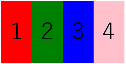
要素を上から下(左から右)に折り返す(flex-wrap : wrap)
親要素に「flexwrap : wrap」を設定すると、要素が親要素に収まりきらなくなった場合に、自動的に折り返してくれます。
以下の例では、親要素の横幅が700pxなのに対し、全要素の横幅が200px×4個=800pxなので、収まりきらなくなった最後の1要素が下段に折り返されています。
.wrapper{width:700px; display:flex; flex-wrap:wrap;}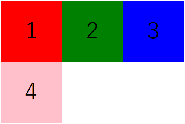
「flex-direction : row-reverse」と組み合わせた場合
.wrapper{width:700px; display:flex; flex-direction:row-reverse; flex-wrap:wrap;}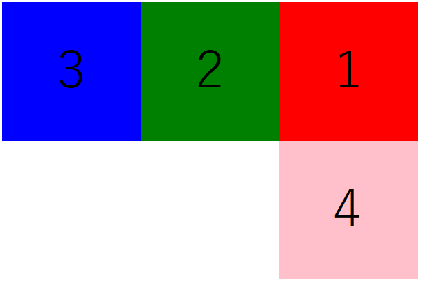
「flex-direction : column」と組み合わせた場合
「flex-direction : column」で縦並びにした場合は、不思議な表示となります。
.wrapper{height:700px; display:flex; flex-direction:column; flex-wrap:wrap;}
なんと、1段目と2段目の間に謎の隙間ができてしまいました。
隙間をなくす場合は、親要素の横幅を子要素の横幅の合計(今回は200px+200px=400px)以下に設定すると、隙間なく並びます。
.wrapper{height:700px; width:400px; display:flex; flex-direction:column; flex-wrap:wrap;}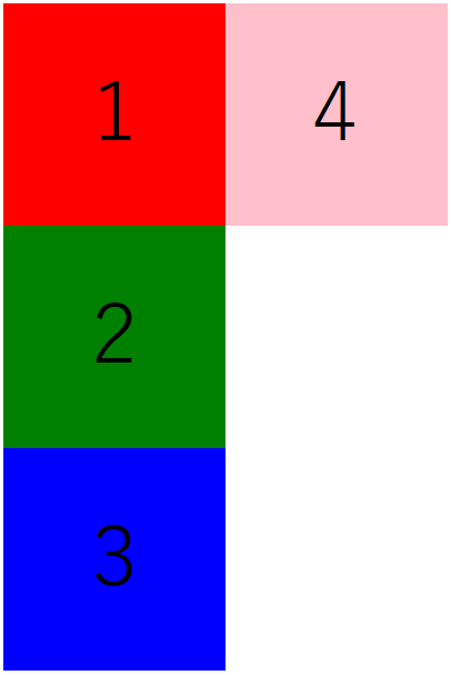
親要素の横幅が子要素の横幅の合計をオーバーした分だけ、隙間が生成されます。
以下の場合は、親要素410px、子要素の合計400pxなので、410px – 400px=10px分の隙間が生成されます。
.wrapper{height:700px; width:410px; display:flex; flex-direction:column; flex-wrap:wrap;}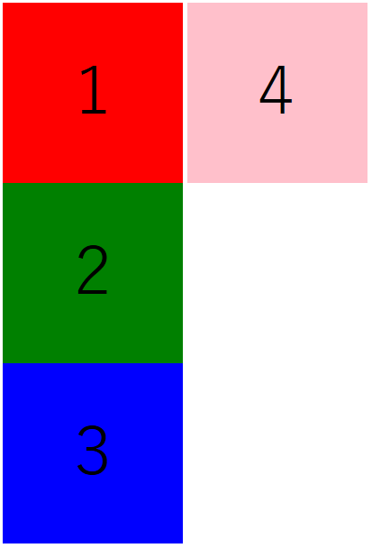
要素を下から上(右から左)に折り返す(flex-wrap : wrap-reverse)
要素を下から上に折り返す場合は、親要素に「flex-wrap : wrap-reverse」を設定します。
.wrapper{width:700px; display:flex; flex-wrap:wrap-reverse;}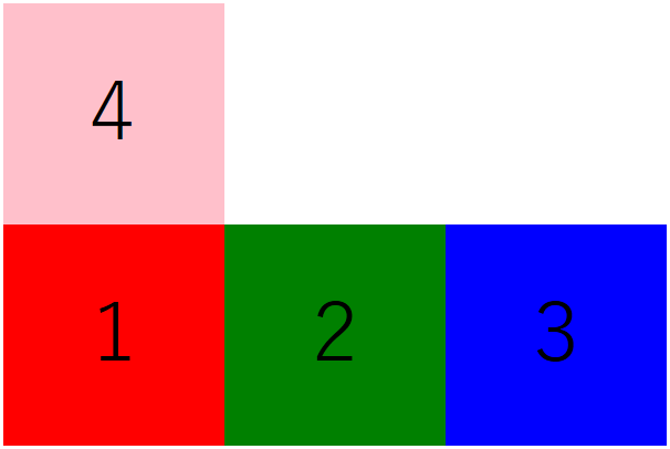
「flex-direction : column」と組み合わせた場合
.wrapper{height:700px; width:410px; display:flex; flex-direction:column; flex-wrap:wrap-reverse;}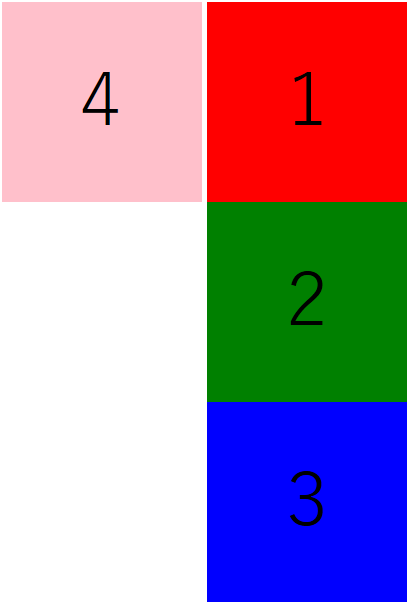
水平方向の位置を設定する(justify-content)
要素を左揃えにするのか、右揃えにするのか、中央揃えにするのかを調整するためには、親要素に「justify-content」を設定します。
要素を左揃えにする(justify-content : flex-start)※省略可
「justify-content : flex-start」を設定すると、要素を左揃えにすることができます。
これはデフォルトの設定なので、省略することが可能です。
今回は分かりやすいように、親要素にグレーのボーダーを設定しています。
.wrapper{border:30px solid gray; display:flex; justify-content:flex-start;}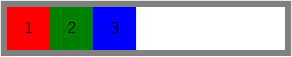
要素を右揃えにする(justify-content : flex-end)
.wrapper{border:30px solid gray; display:flex; justify-content:flex-end;}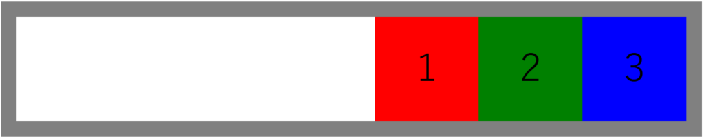
要素を中央揃えにする(justify-content : center)
.wrapper{border:30px solid gray; display:flex; justify-content:center;}
左右を空けず要素を等間隔にする(justify-content : space-between)
.wrapper{border:30px solid gray; display:flex; justify-content:space-between;}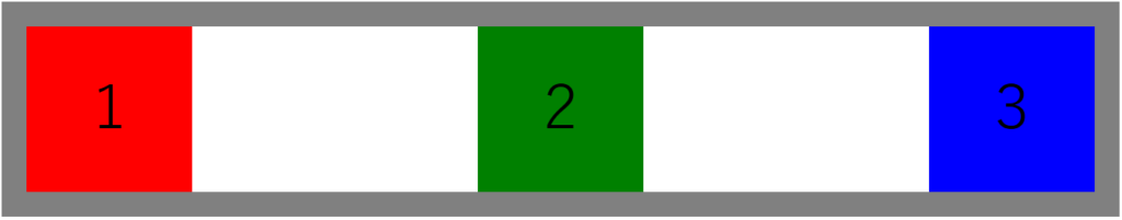
左右も含めて要素を等間隔にする(justify-content : space-around)
.wrapper{border:30px solid gray; display:flex; justify-content:space-around;}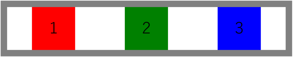
要素の並び順と折り返しを一括指定する(flex-flow)
「flex-flow」を使うと、要素の並び順「flex-direction」と折り返し「flex-wrap」を一括で指定できます。
「flex-flow : (flex-directionの値)(flex-wrapの値)」と記述します。
以下の例では、要素の並び順を「右から左」に、折り返しを「あり」に設定しています。
.wrapper{width:700px; display:flex; flex-flow:row-reverse wrap;}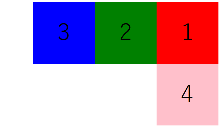
垂直方向の位置を設定する(align-items)
要素を上揃えにするのか、下揃えにするのか、中央揃えにするのかを調整するためには、親要素に「align-items」を設定します。
要素の余白を埋める(align-items : stretch)※省略可
親要素に「align-items : stretch」を設定すると、各要素は親要素との垂直方向の余白を埋めるように広がって表示されます。
これはデフォルト設定なので、省略可能です。
ただし、子要素の高さ(height)が指定されている場合は広がりません(「flex-start」と同様の表示となります)。
.wrapper{height:400px; border:30px solid gray; display:flex; align-items:stretch;}
.square1{background-color:red; width:200px;}
.square2{background-color:green; width:200px;}
.square3{background-color:blue; width:200px;}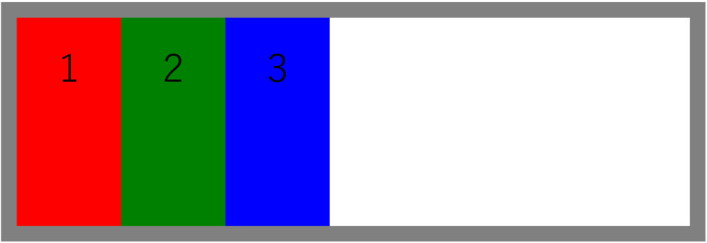
要素を上揃えにする(align-items : flex-start)
.wrapper{border:30px solid gray; display:flex; align-items:flex-start;}
.square1{background-color:red; width:200px; height:200px;}
.square2{background-color:green; width:200px; height:300px;}
.square3{background-color:blue; width:200px; height:400px;}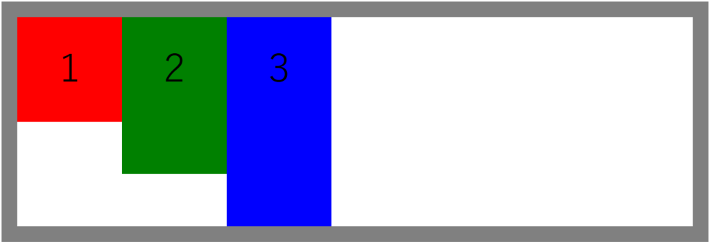
要素を下揃えにする(align-items : flex-end)
.wrapper{border:30px solid gray; display:flex; align-items:flex-end;}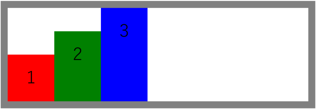
要素を中央揃えにする(align-items : center)
各要素の上下の余白を均等にする場合に使用します。
.wrapper{border:30px solid gray; display:flex; align-items:center;}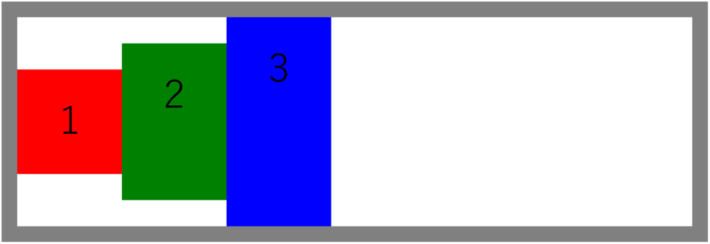
要素をベースラインに合わせる(align-items : baseline)
「align-items : baseline」を設定すると、要素内にあるテキストが一直線に横並びになるように調整されます。
以下は、赤の要素のテキストの位置を設定した場合です。
緑と青の要素はテキストの位置を赤に揃えるように、上下方向の配置が決定されます。
.wrapper{border:30px solid gray; display:flex; align-items:baseline;}
.square1{background-color:red; width:200px; height:200px; line-height:200px;}
.square2{background-color:green; width:200px; height:300px;}
.square3{background-color:blue; width:200px; height:400px;}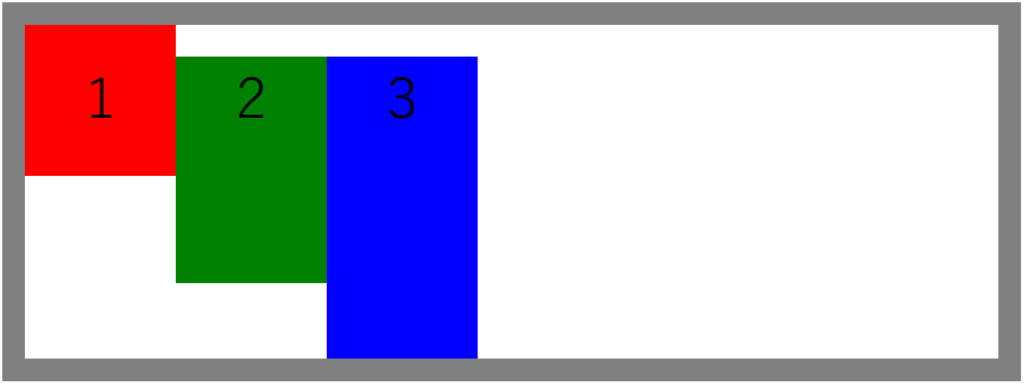
以下の場合は、中央(緑)の要素のテキストの位置に、左(赤)と右(青)が揃っています。
.wrapper{border:30px solid gray; display:flex; align-items:baseline;}
.square1{background-color:red; width:200px; height:200px; line-height:200px;}
.square2{background-color:green; width:200px; height:300px; line-height:300px;}
.square3{background-color:blue; width:200px; height:400px;}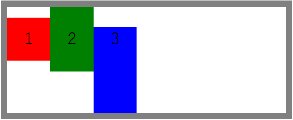
要素を個別に設定する(align-items : align-self)
親要素に「align-items : align-self」を設定し、各要素に「align-self」で個別に位置の設定をすると、要素別に垂直位置を変更することができます。
.wrapper{border:30px solid gray; height:400px; display:flex; align-items:align-self;}
.square1{background-color:red; width:200px; height:200px; align-self:flex-start;}
.square2{background-color:green; width:200px; height:200px; align-self:flex-end;}
.square3{background-color:blue; width:200px; height:200px; align-self:center;}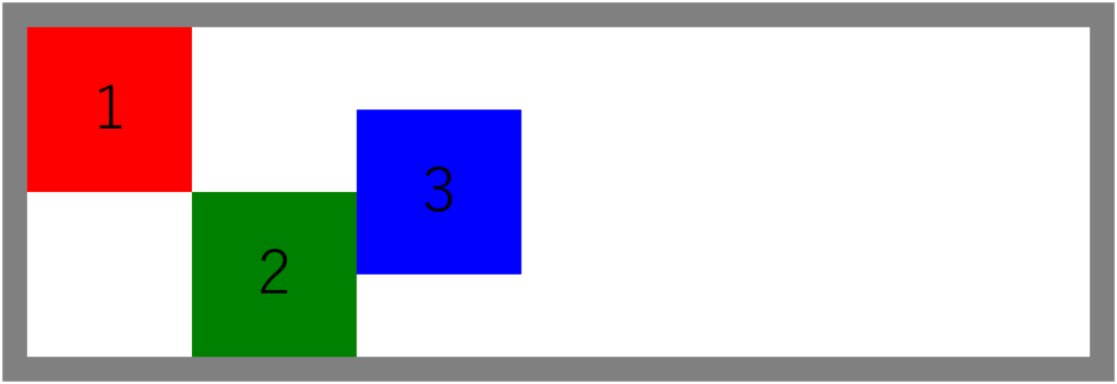
複数行の垂直位置を設定する(align-content)
要素が複数行になった際の垂直位置の調整には、「align-content」を使用します。
複数行要素の垂直方向の余白を埋める(align-content : stretch)※省略可
親要素に「align-content : stretch」を設定すると、各行の要素は垂直方向の余白を埋めるように広がります。
この設定はデフォルトなので、省略可能です。
ただし、子要素の高さ(height)が設定されている場合は広がりません(「flex-start」と同様になる)。
<html>
<head>
<meta charset="UTF-8">
<style>
main{font-size:72px; text-align:center; line-height:200px;}
.wrapper{border:30px solid gray; height:500px; width:700px; display:flex; flex-wrap:wrap; align-content:stretch;}
.square1{background-color:red; width:200px;}
.square2{background-color:green; width:200px;}
.square3{background-color:blue; width:200px;}
.square4{background-color:purple; width:200px;}
.square5{background-color:brown; width:200px;}
.square6{background-color:pink; width:200px;}
</style>
</head>
<body>
<main>
<div class="wrapper">
<div class="square1">1</div>
<div class="square2">2</div>
<div class="square3">3</div>
<div class="square4">4</div>
<div class="square5">5</div>
<div class="square6">6</div>
</div>
</main>
</body>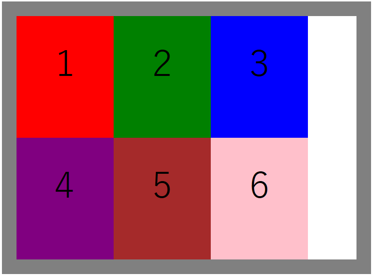
複数行要素を上揃えにする(align-content : flex-start)
.wrapper{border:30px solid gray; height:500px; width:700px; display:flex; flex-wrap:wrap; align-content:flex-start;}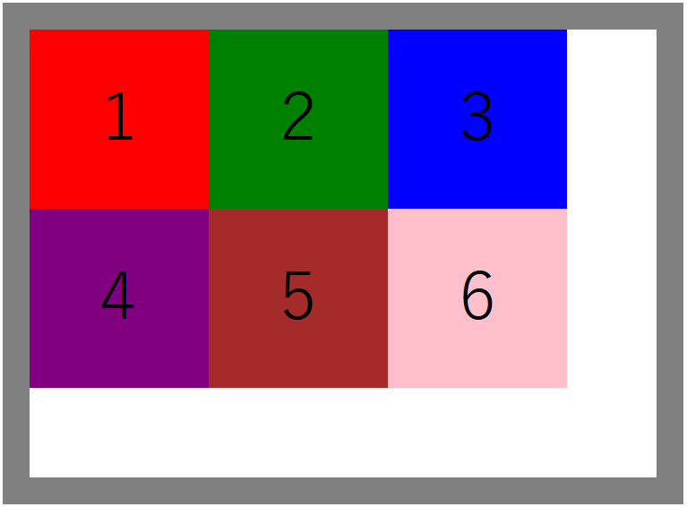
複数行要素を下揃えする(align-content : flex-end)
.wrapper{border:30px solid gray; height:500px; width:700px; display:flex; flex-wrap:wrap; align-content:flex-end;}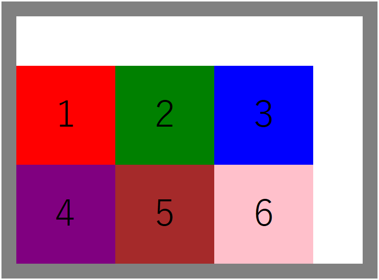
最上行を上揃え、最下行を下揃えにして行間を均等に空ける(align-content : space-between)
.wrapper{border:30px solid gray; height:500px; width:700px; display:flex; flex-wrap:wrap; align-content:space-between;}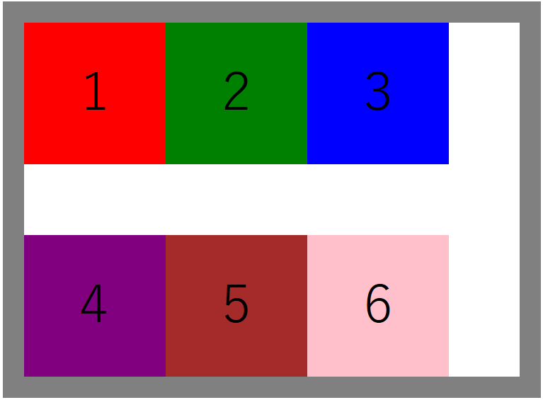
各行を等間隔に空ける(align-content : space-around)
.wrapper{border:30px solid gray; height:500px; width:700px; display:flex; flex-wrap:wrap; align-content:space-around;}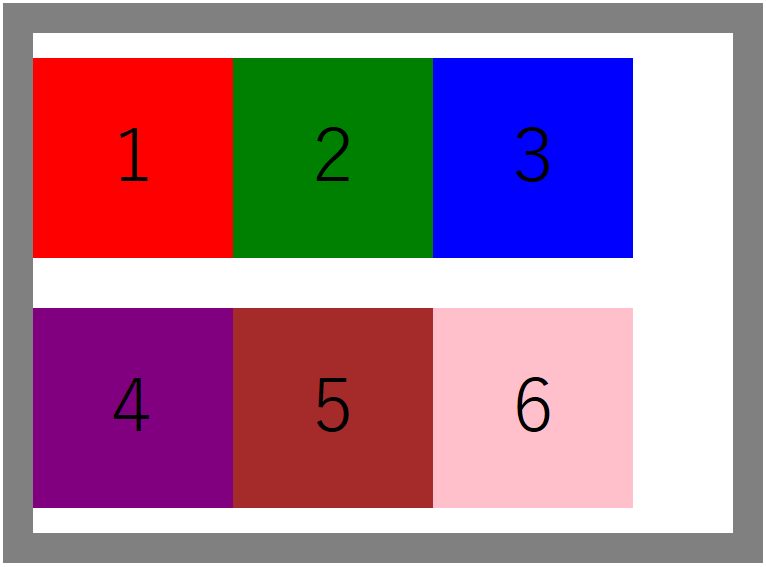
その他のプロパティ
要素の並び順を変更する
html上の並び順とは関係なく要素の並び順を変更したい場合は、各要素に「oredr」プロパティを設定します。
以下の例では、本来の並び順(赤→緑→青)が青→緑→赤に変更されています。
<html>
<head>
<meta charset="UTF-8">
<style>
main{font-size:72px; text-align:center; line-height:200px;}
.wrapper{display:flex;}
.square1{background-color:red; width:200px; height:200px; order:2;}
.square2{background-color:green; width:200px; height:200px; order:3;}
.square3{background-color:blue; width:200px; height:200px; order:1;}
</style>
</head>
<body>
<main>
<div class="wrapper">
<div class="square1">1</div>
<div class="square2">2</div>
<div class="square3">3</div>
</div>
</main>
</body>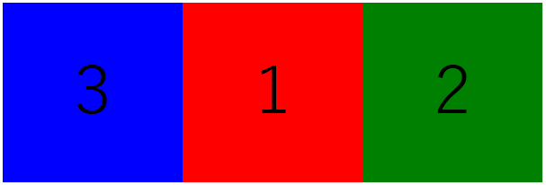
要素の伸び率を設定する(flex-grow)
「flex-grow」を使うと、各要素の幅の比率を設定できます。
以下の例では、横幅を赤:緑:青=1:3:2に設定しています。
仮に親要素の横幅が600pxであれば、赤100px、緑300px、青200pxになります。
デフォルトの値は1で、2は2倍、3は3倍に伸びるといった感じです。
0以下は指定できません。
.square1{background-color:red; height:200px; flex-grow:1;}
.square2{background-color:green; height:200px; flex-grow:3;}
.square3{background-color:blue; height:200px; flex-grow:2;}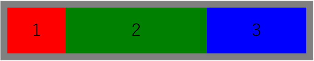
要素の縮み率を設定する(flex-shrink)
「flex-shrink」を設定すると、子要素の幅の合計が親要素を超えた場合に、縮めることができます。
下記の例では、親要素の横幅が500pxなのに対して、子要素の合計が900pxとなっています。
そこで、赤に対して「flex-shrink:2」を設定することによって、赤を半分に縮めています。
結果、赤100px、緑200px、青200pxとなっています。
デフォルトの値は1で、2だと半分、3だと1/3、0.5だと2倍のように変化していきます。
.wrapper{border:30px solid gray; width:500px; display:flex;}
.square1{background-color:red; height:200px; width:300px; flex-shrink:2;}
.square2{background-color:green; height:200px; width:300px;}
.square3{background-color:blue; height:200px; width:300px;}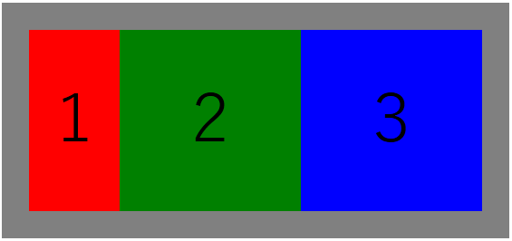
ちなみに「flex-shrink:0」と設定すると、その要素は縮まずに与えられた幅を維持します。
下記の例では、赤だけが300pxを維持し、緑と青は残り200pxを等分するように縮みます。
.wrapper{border:30px solid gray; width:500px; display:flex;}
.square1{background-color:red; height:200px; width:300px; flex-shrink:0;}
.square2{background-color:green; height:200px; width:300px;}
.square3{background-color:blue; height:200px; width:300px;}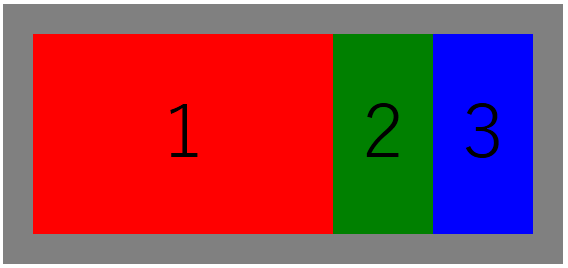
各要素の親要素に対する比率(ベース)を設定する(flex-basis)
各要素に「flex-basis」を設定することで、親要素に対してどれくらいの幅になるのかを設定できるようになります。
以下の例では、親要素の横幅(500px)に対し、赤を10%、緑を20%、青を30%と設定しています。
残りの余白は、100% – 10% – 20% – 30%=40%となっています。
.wrapper{border:30px solid gray; width:500px; display:flex;}
.square1{background-color:red; height:200px; flex-basis:10%;}
.square2{background-color:green; height:200px; flex-basis:20%;}
.square3{background-color:blue; height:200px; flex-basis:30%;}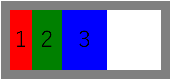
伸び率・縮み率・ベースを一括指定する(flex)
「flex」を使うと「flex-grow」「flex-shrink」「flex-basis」を3つをまとめて設定できます。
「flex:(flex-growの値)(flex-shrinkの値)(flex-basisの値)」のように設定します。
.square1{background-color:red; height:200px; flex:1 0 50%;}
.square2{background-color:green; height:200px; flex:3 0 20%;}
.square3{background-color:blue; height:200px; flex:2 0 30%;}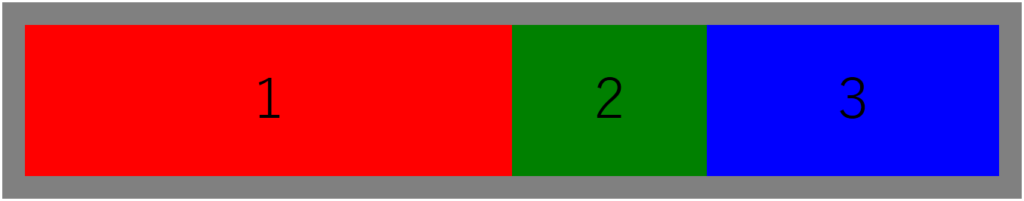
ピラミッドを作ってみる(応用編)
「Flexbox」を使えば以下のようなピラミッドを作成することも容易です。
まずは「wrapper-top」「wrapper-center」「wrapper-bottom」の3段階に分け、それぞれに対して「Flexbox」で要素を横並びにしています。
<html>
<head>
<meta charset="UTF-8">
<style>
main{font-size:72px; text-align:center; line-height:200px;}
.wrapper{display:flex; flex-direction:column;}
.wrapper-top{display:flex;}
.wrapper-center{display:flex;}
.wrapper-bottom{display:flex;}
.square1{background-color:red; width:200px; height:200px; margin-left:200px;}
.square2{background-color:green; width:200px; height:200px; margin-left:100px;}
.square3{background-color:blue; width:200px; height:200px;}
.square4{background-color:pink; width:200px; height:200px;}
.square5{background-color:orange; width:200px; height:200px;}
.square6{background-color:tomato; width:200px; height:200px;}
</style>
</head>
<body>
<main>
<div class="wrapper">
 <div class="wrapper-top">
  <div class="square1">1</div>
 </div>
 <div class="wrapper-center">
  <div class="square2">2</div>
  <div class="square3">3</div>
 </div>
 <div class="wrapper-bottom">
  <div class="square4">4</div>
  <div class="square5">5</div>
  <div class="square6">6</div>
 </div>
</div>
</main>
</body>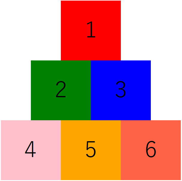
まとめ
いかがでしたでしょうか?
「float」に比べると、ずいぶん簡単に横並びを実現することができますね。
似た手法に「CSS Grid Layout」がありますので、今後はそちらも紹介していこうと思います。
コメント